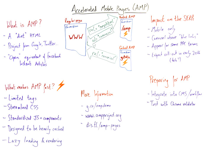
Knowns
- # of HTTP Requests
- # of Bytes
- Images, Animations, Interactions
- Squishiness
- Responsiveness
Unknowns
- Network (latency, bandwidth)
- Hardware (processing power)
- Browser (blocking, features)
Open Web Evangelist
Instart Logic
Twitter:
@webdevtips
@estellevw
@standardista
Blog:
www.standardista.com
Github:
github.com/estelle


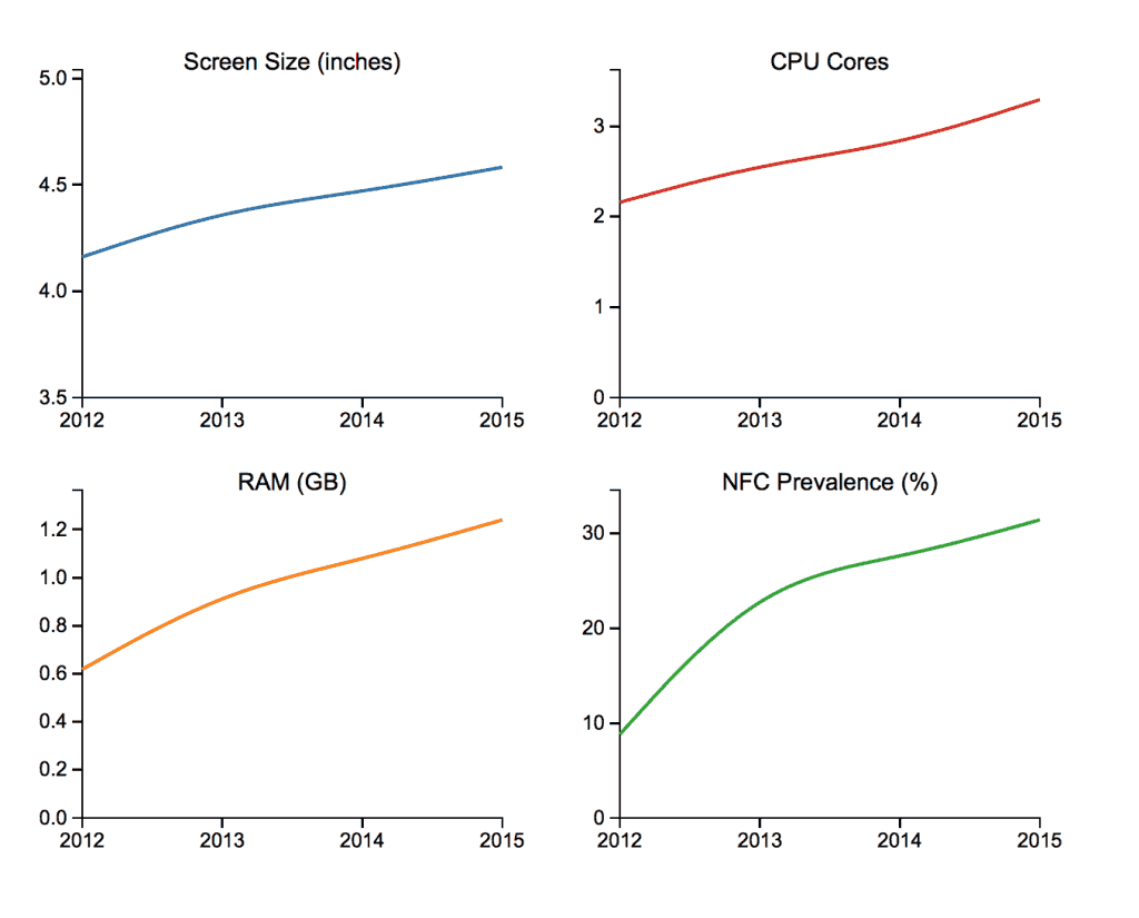
Via OpenSignal

Via OpenSignal
49mm x 57mm to 163mm x 302mm
Via OpenSignal


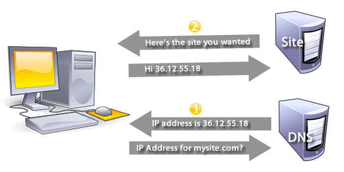
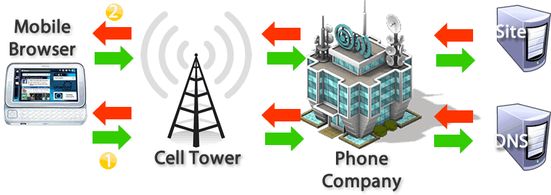

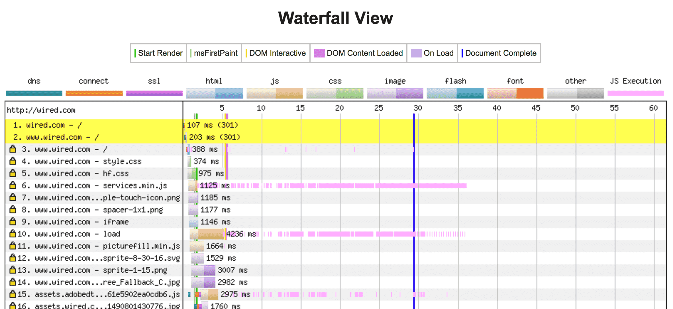
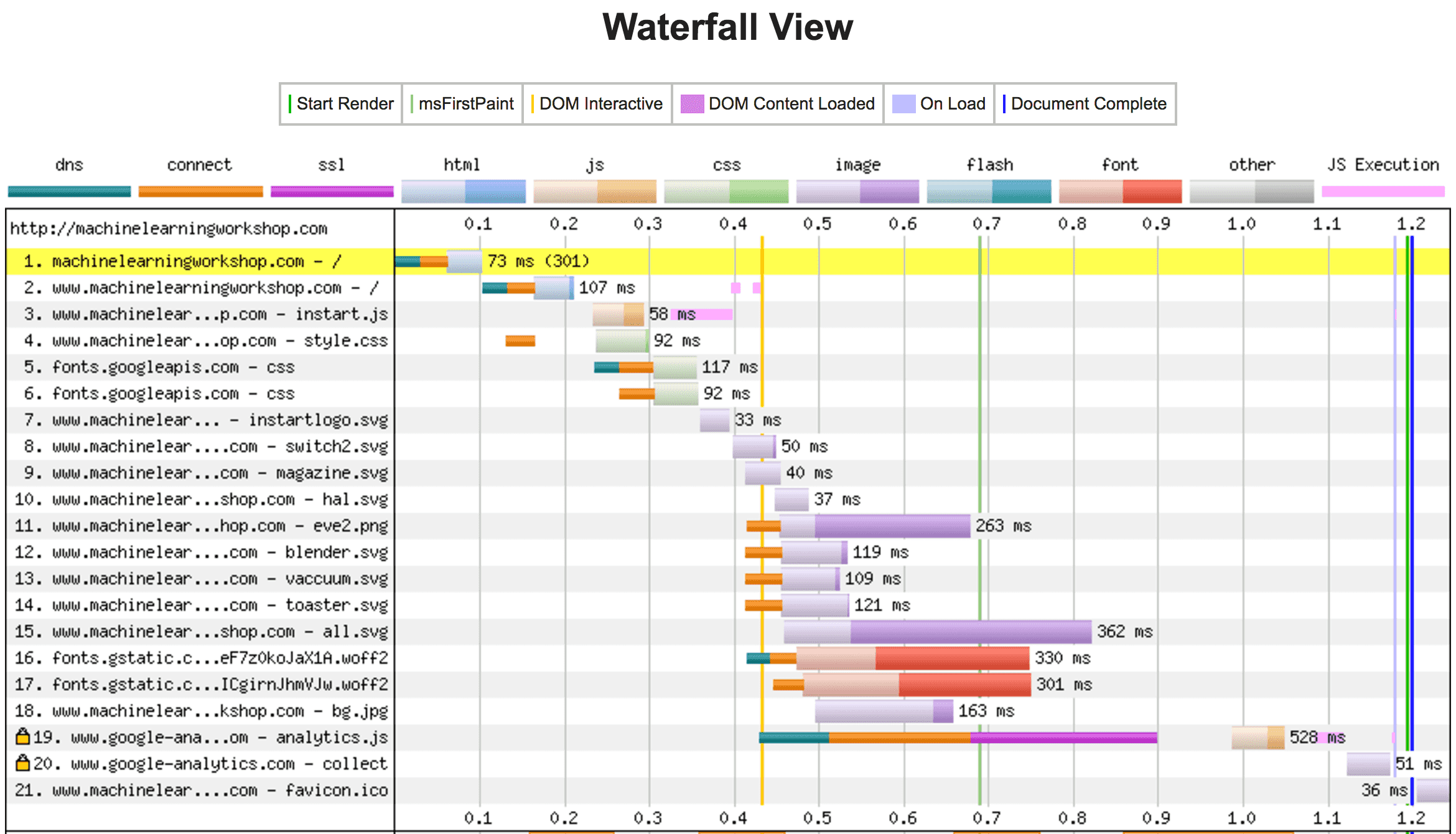
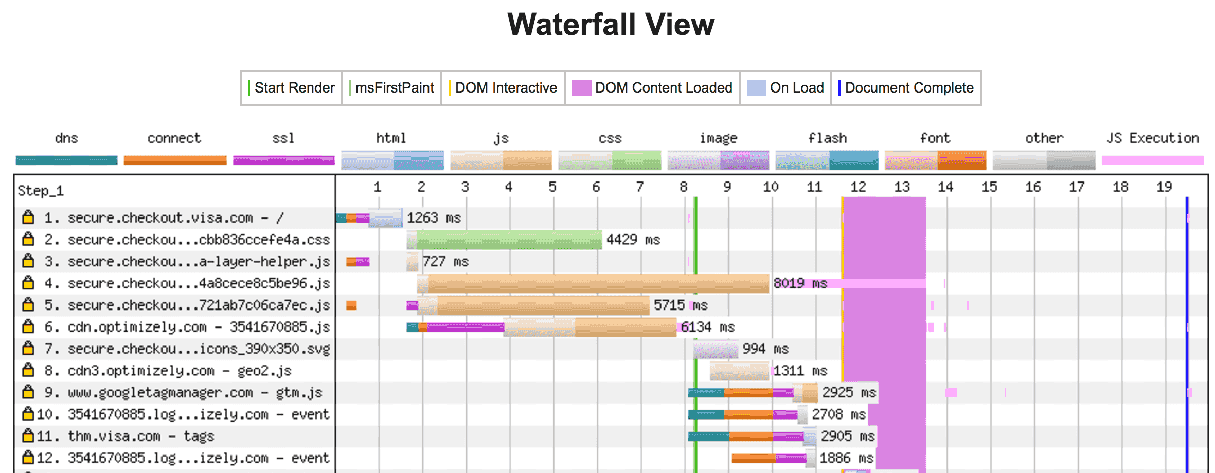
TTFB = Latency + Server Time
Limit # of handshakes & bandwidth req
TTFB = Latency + Server Time
Limit # of handshakes & bandwidth req
<meta name="viewport"
  content="initial-scale=1.0,
           maximum-scale=1.0,
           minimum-scale=1.0,
           user-scalable=no,
           width=device-width">

240 x 240 = 57,600
200 x 200 = 40,000
            17,600

440 x 440 = 193,600
400 x 400 = 160,000
             33,600
640 x 640 = 409,600
600 x 600 = 360,000
             49,000
840 x 840 = 705,600
800 x 800 = 640,000
             65,600
Scaled: 1,850 milliseconds
Right-sized: 625 milliseconds
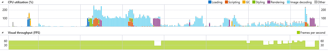
 blue = CPU used to decode
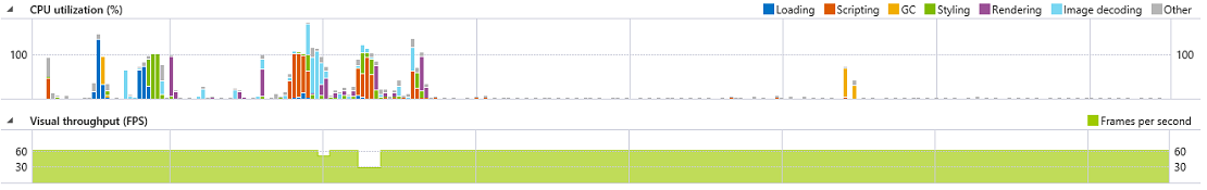
Test during development
Set a budget before you start
instartlogic.github.io/p/mobileperf
Twitter:
@webdevtips
@estellevw
@standardista
Blog:
www.standardista.com
Github:
github.com/estelle